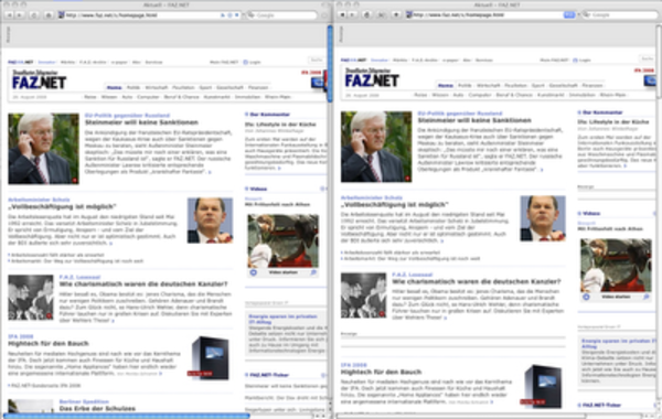
When I bought a Macbook this winter, I was impressed by Safari's slim look and excellent rendering performance. But I was soon missing some features with the most important one being a user-friendly and configurable Ad-Blocker. Although SafariBlock is quite usable, I miss the block-this-image context menu option, the filters are not as mature as those used by Firefox' Adblock Plus, that even removes those nasty boxes surrounding banners.
This morning I read an interesting blog post, in which John M. Harrell uses some plugins to make Firefox3 look much like Safari. The only thing left for me to do was to provide Firefox' Fission Plugin with an image of Safari's original gradient-style page-loading status bar. The result looks quite promising:
Please note those missing boxes labeled "Anzeige" on the right column, which are correctly removed in Firefox. Use this image for the Fission plugin:

